 ;
;
Main
[av_codeblock wrapper_element=’style’ wrapper_element_attributes=” custom_class=”]
body#top {
margin: 0 !important;
width: 100% !important;
}
.responsive.html_boxed.html_header_sticky #header {
width: 100%;
}
.inner-container {
max-width: 1350px;
margin: 0 auto;
}
.html_header_top.html_header_sticky #top #wrap_all #main {
padding-top: 50px;
}
.responsive .container {
max-width: 100%;
padding: 0;
}
.content,
.sidebar {
padding: 0;
}
.avia_codeblock .center {
position: relative;
width: 100%;
height: 0;
padding-bottom: 26.4%;
margin: 0 auto;
overflow: hidden;
}
.container h2 {
padding-bottom: 10px;
}
.container p {
line-height: 1.2;
}
.mo {
display: none;
}
.skewdBox {
position: absolute;
top: 0;
left: 0;
width: 60%;
height: 100%;
padding: 50px 80px;
z-index: 1;
transform: skewX(-10deg) translateX(-87px);
overflow: hidden;
}
.skewdBox:before {
content: “”;
width: 100%;
height: 100%;
position: absolute;
top: 0;
left: 0;
background: url(/en/wp-content/uploads/sites/3/2020/03/2.png) no-repeat center;
background-size: cover;
background-position: left;
transform: skewX(10deg) translateX(87px);
z-index: -1;
}
.section2 {
float: right;
width: 47%;
background-color: #616161;
}
.section2 iframe {
position: absolute;
width: 47%;
height: 100%
}
#recomPro {
margin-bottom: 40px;
}
#recomPro > div.inner {
width: 100%;
margin: 0 auto;
}
#recomPro .slideWrap {
position: relative;
overflow: hidden;
height: 330px;
margin: 3% 0;
}
#recomPro .tickerSlide {
position: absolute;
top: 0px;
left: 0px;
overflow: hidden;
-webkit-transition-timing-function: linear;
/* Safari and Chrome */
transition-timing-function: linear;
}
#recomPro .tickerSlide li {
float: left;
width: 450px;
background: none;
}
#recomPro .tickerSlide li img {
margin: 0 auto;
}
.solar-power {
overflow: hidden;
margin-bottom: 3%;
}
.solar-power li {
float: left;
width: 50%;
background: none !important;
padding: 0 !important;
position: relative;
}
.solar-power li:first-child {
width: 49%;
margin-right: 1%;
}
.solar-power li ul {
margin: 0;
}
.solar-power li ul li {
width: 100%;
position: relative;
}
.solar-power li ul li .right-title {
position: absolute;
bottom: 1px;
left: 0;
z-index: 4;
background: #404040;
padding: 2%;
}
.solar-power li ul li:last-child .right-title {
bottom: 6px;
}
.solar-power li ul li .right-title h2 {
color: #fff;
font-size: 23px;
line-height: 23px;
padding: 0;
margin: 0;
}
.solar-power li ul li .right-title h2 img {
float: right;
max-width: 20px;
vertical-align: middle;
margin-left: 40px;
}
.solar-power li ul li img {
width: 100%;
}
.solar-power li ul li:first-child {
width: 100%;
margin-right: 0;
margin-bottom: 2%;
}
div#myslider2 a {
width: 100%;
}
.slider {
width: 100%;
padding-bottom: 38.378%;
}
.height-left p {
text-align: right;
font-size: 20px;
line-height: 1.5;
color: #fff;
margin: 0;
padding-right: 5%;
padding-top: 15%;
}
.slider div {
width: 100%;
}
.slider img {
width: 100%;
}
.wrapper {
width: 100%;
margin: 0;
}
.height-left {
padding-bottom: 94.2%;
background: #404040;
}
.left-title {
position: absolute;
bottom: 12%;
right: 5%;
z-index: 1;
}
.left-title h2 {
color: #fff;
}
.left-title h2:after {
content: “”;
display: block;
border-bottom: 5px solid #fff;
width: 40px;
margin: 20px 0 20px auto;
}
.global-wrap {
margin-bottom: 3%;
}
.global-network {
overflow: hidden;
width: 100%;
margin: 0 auto;
max-width: 1760px;
}
.global-network li {
background: none !important;
padding: 0 !important;
float: left;
width: 25%;
}
#socket .copyright .left {
display: block !important;
}
.bx-wrapper {
margin-bottom : 0 !important;
-webkit-box-shadow : none !important;
box-shadow : none !important;
border : none !important;
padding : 30px 0 !important;
}
.entry-content-wrapper div li {
background : none !important;
padding-left : 0;
}
.entry-content-wrapper div li a:hover img, .entry-content-wrapper div li img {
margin : 0 auto !important;
}
@media screen and (max-width : 1850px) {
.skewdBox {
width: 61%;
}
}
@media screen and (max-width : 1560px) {
.skewdBox {
width: 62%;
}
}
@media screen and (max-width : 1336px) {
.left-title h2:after {
margin: 15px 0 15px auto;
}
}
@media screen and (max-width : 1320px) {
.skewdBox {
width: 63%;
}
}
@media screen and (max-width : 1140px) {
.skewdBox {
width: 64%;
}
.left-title {
bottom: 10%;
}
}
@media screen and (max-width : 1020px) {
.skewdBox {
width: 65%;
}
}
@media screen and (max-width : 989px) {
.av_header_border_disabled {
margin-top: 0 !important;
}
.html_header_top.html_header_sticky #top #wrap_all #main {
margin-top: 30px !important;
}
.height-left {
padding-bottom: 95.4%;
}
}
@media screen and (max-width : 920px) {
.skewdBox {
width: 66%;
}
.height-left p {
padding-top: 11%;
}
.left-title h2:after {
margin: 10px 0 10px auto;
}
}
@media screen and (max-width : 840px) {
.skewdBox {
width: 67%;
}
}
@media screen and (max-width: 767px) {
.responsive #top #wrap_all .container {
width: 100%;
max-width: 100%;
}
#recomPro .tickerSlide li {
width: 300px;
}
.web {
display: none;
}
.mo {
display: block;
}
.main-banner-img img {
width: 100%;
}
.video-wrap {
width: 100%;
position: relative;
padding-bottom: 56.25%;
margin: -6px auto 0;
}
.video-wrap iframe {
position: absolute;
width: 100%;
height: 100%;
}
.solar-power li:first-child {
width: 100%;
margin-right: 0;
margin-bottom: 2%;
}
.solar-power li {
width: 100%;
}
.left-title {
bottom: 15%;
}
.left-title {
bottom: 15%;
}
.height-left p {
padding-top: 15%;
}
.global-network {
max-width: 90%;
}
.global-network li {
width: 48%;
margin: 0 1% 5% !important;
}
}
@media screen and (max-width : 670px) {
.global-network li {
width: 100%;
margin-bottom: 5% !important;
}
.mo2 {
display: none;
}
}
@media screen and (max-width : 570px) {
.left-title {
bottom: 13%;
}
.height-left p {
padding-top: 13%;
}
}
@media screen and (max-width : 425px) {
#recomPro {
margin: 0;
}
.left-title {
bottom: 10%;
}
.height-left p {
padding-top: 11%;
}
}
@media screen and (max-width : 375px) {
.left-title h2 {
font-size: 23px;
}
.height-left p {
padding-top: 13%;
font-size: 13px;
}
}
[/av_codeblock]
[av_codeblock wrapper_element=’html’ wrapper_element_attributes=” custom_class=”]
;[/av_codeblock]
[av_codeblock wrapper_element=’html’ wrapper_element_attributes=” custom_class=”]


[/av_codeblock]
[av_codeblock wrapper_element=” wrapper_element_attributes=” custom_class=”]
-
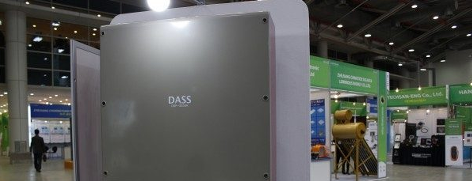
Solar Power plant project

Location: Bangna-Trat, Thailand
Capacity: 1MW Location: Chonburi, Thailand
Capacity: 10MW Location: Sisaket, Thailand
Capacity: 3MW Location: Bangkok, Thailand
Capacity: 150kW Location: Aranyaprathet, Thailand
Capacity: 90MW Location: Jeon-nam, Korea
Capacity: 7MW -
-
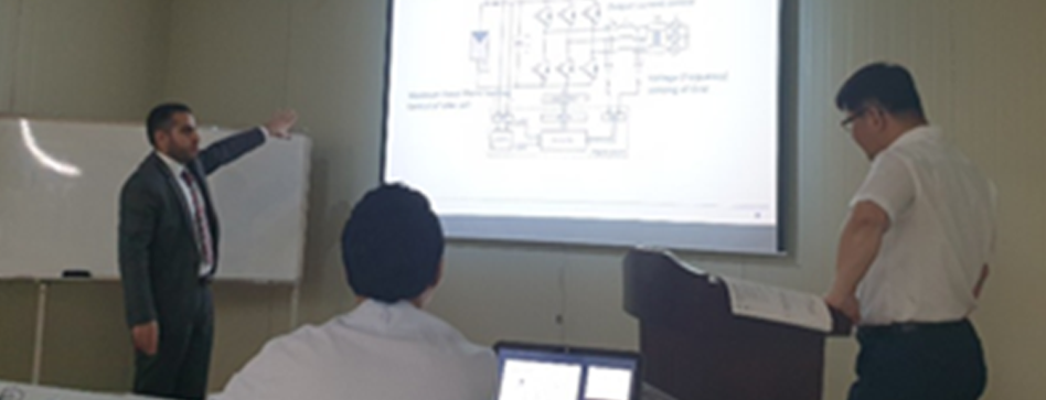
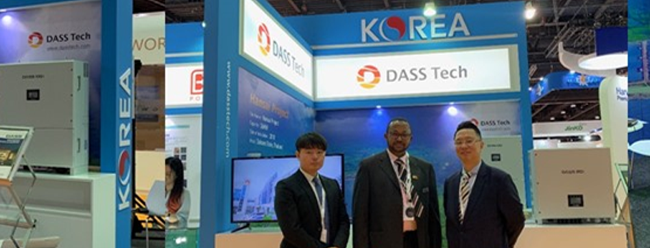
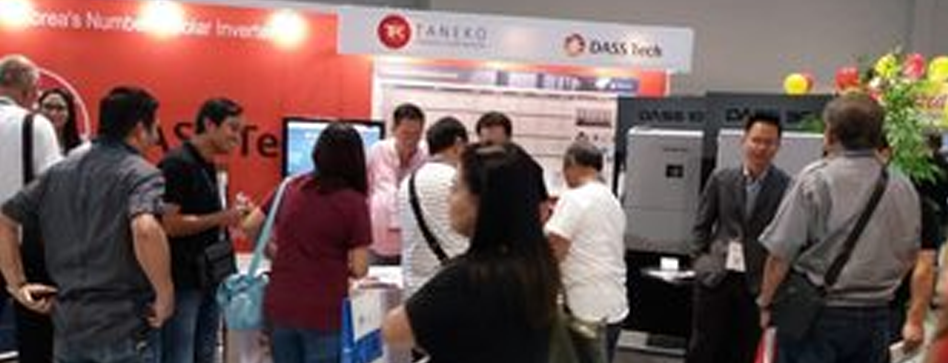
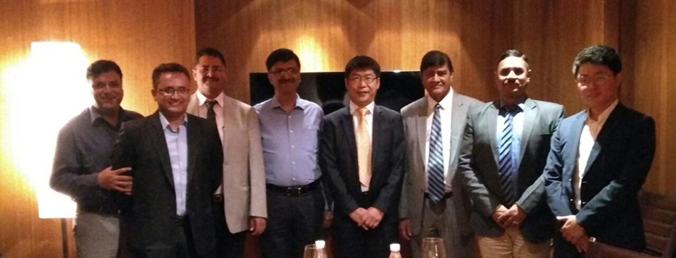
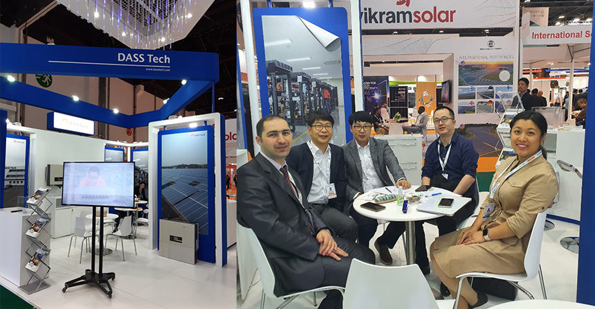
NEWS


-
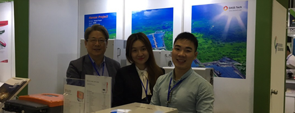
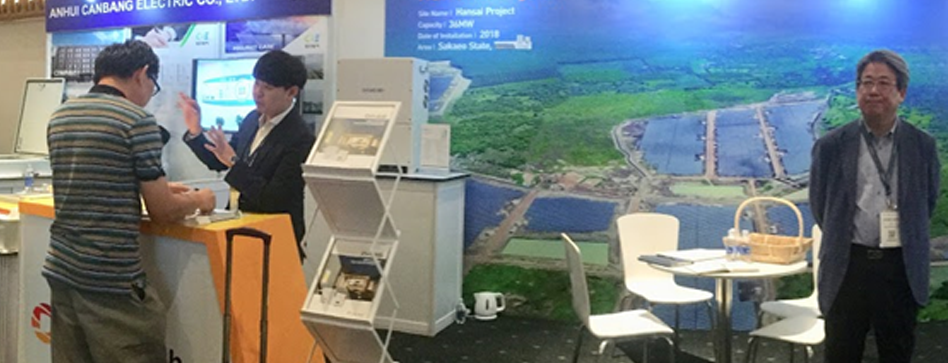
Exhibition Schedule
-
[/av_codeblock]
[av_codeblock wrapper_element=’html’ wrapper_element_attributes=” custom_class=”]
-
KOREA
DASS TECH Co., Ltd
HeadQuarters & Laboratory
109, Yangcheongsongdae-gil, Ochang-eup, Cheongwon-gu,
Cheongju-si, Chungbuk, 28118, Korea
Tel : +82 43 218 8830
E-mail : globalbiz@dasstech.com -
DASS TECH Co., Ltd
Global Business & A/S
81, Yangcheongsongdae-gil, Ochang-eup, Cheongwon-gu,
Cheongju-si, Chungbuk, 28118, Korea
Tel : +82 43 218 8830
E-mail : globalbiz@dasstech.com -
Thailand
DASS International Co., Ltd.
3388/7 2nd Floor Sirinrat Building, Rama IV Road,
Klongtun, Klongtoey, Bangkok 10110 Thailand
Tel: +66-2-367-5357
Fax: +66-2-367-5359
E-mail : changk@gmenergy.co.th -
Vietnam
DASS Vina CO., LTD
HORNET VIETNAM SERVICE AND TRADING Co.Ltd.
57/6 Pham Thai Buong Street, Nam Thien | (H13)
Quarter, Tan Phong Ward, District 7, Ho Chi Minh City,Vietnam
Tel : (English/Vietnamese) +84 90 118 76 91
E-mail : apexkim@apexglobal.co.kr
[/av_codeblock]